SEARCH...
I am so glad you're here! Within my blog, you'll lifestyle, decor, style, and more.
i'm krystal
Kitchen
March 31, 2022
Our kitchen is a mix of elevated modern with natural elements, and I wanted to create an overall luxury aesthetic. For our kitchen renovation, I had endless design inspiration pinned and saved. But there were certain elements I knew I wanted to incorporate, it just was a matter of finding a way for them all to work together.
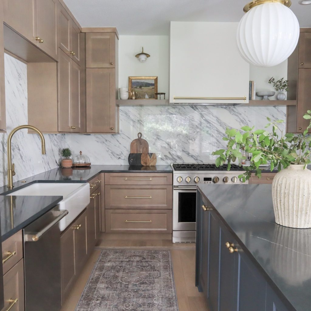
The full slab marble backsplash was a key focal, and I choose to offset that with dark countertops for contrast. This backsplash was quite the feat, as it needed to be seamed together in multiple places to achieve the look. I chose to keep a polished finish to help with wiping down and maintenance, and I love the high end, sleek look it gives. The marble is Italian Arabescato Corchia in a 2cm thickness.
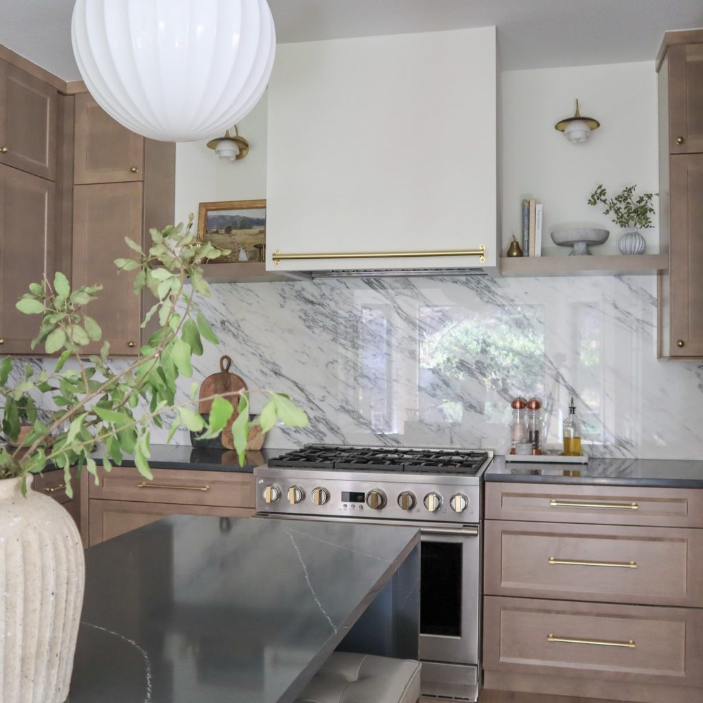
I have been in love with wood cabinetry since it’s been coming back into style, but finding the right tone was important for keeping it feeling modern and not dated. We were lucky to find something that worked doing semi-custom, choosing from certain styles, woods, and finishes. Ours are from the brand Nations Cabinetry in maple, with the Westin door style (a modified shaker), and in the Pecan finish. The stain is a neutral tone with a slight gray hue that compliments the custom color island.
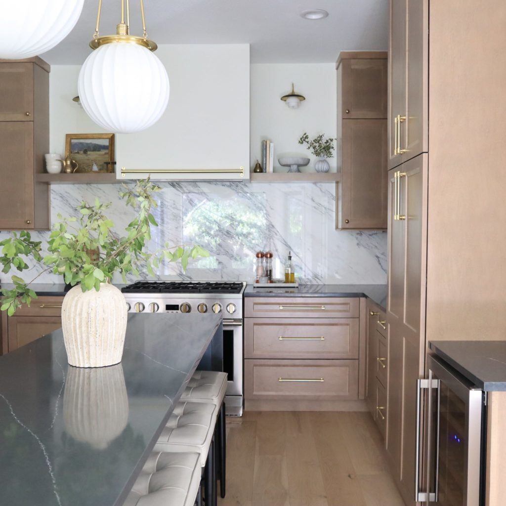
I didn’t want to overwhelm the kitchen with too much wood, so opted to have the island done in a steel blue gray – Grays Harbor from Sherwin Williams.
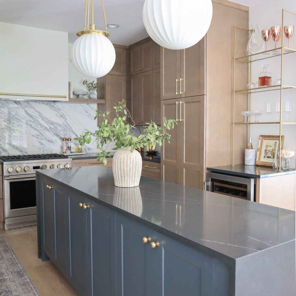
The layout was pretty tight in our kitchen space, but I still wanted an island. The island is pretty skinny – measuring out at just 27″ with the countertop, and 102″. We were still able to fit storage underneath, with room for seating with narrow barstools, and it works!

The finishes are what really make this kitchen for me. All the knobs and pulls are from Rejuvenation, in their Aged Brass finish, as well as the pendant lighting. Since I chose to do a simple, drywall range hood design, I opted to accent the front with a brass pot rail. It is purely decorative, but I love the interest it adds to an otherwise blank canvas. Adding in floating shelves with sconce lighting gives even more style and interest to the space.
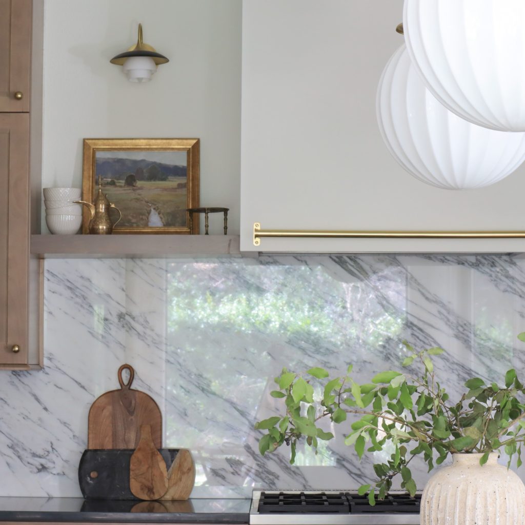

Working with an existing footprint in a remodel can be challenging, but I loved what we were able to achieve in our kitchen. It feels warm, luxury, natural and stylized. And using things like upgraded hardware and finishes can really elevate semi-custom cabinetry and create an overall high end look!
Shop My Kitchen!

Smitten Edit
GET THE
Thoughtfully curated favorites, home & style finds, and exclusive content sent weekly!
ABOUT
ShopMY
shop my lTk
THE SMITTEN COLLECTIVE
At The Smitten Collective you’ll find ideas and inspiration for creating beautiful spaces and elevated everyday style. All the things I'm smitten with, from my home to yours.
pARTNERSHIPS
amazon storefront
the blog
navigate
more Tsc
@thesmittencollective
walmart storefront
target storefront
This site contains affiliate links. As an Amazon Influencer, I earn a commission if you make a purchase using my links.
© 2022 THE SMITTEN COLLECTIVE | brand & web design by embolden design studio
HOME
about
shopMY
the blog
shop my ltk
At The Smitten Collective you’ll find ideas and inspiration for creating beautiful spaces and elevated everyday style. All the things I'm smitten with, from my home to yours.